Save & Pay E-Wallet
On a solo project, designed an application that addresses the problem of users having to switch between apps in order to budget and make transactions. Final testing revealed a 6.5/7 SEQ.
.png)
TL;DR
Competitive Analysis
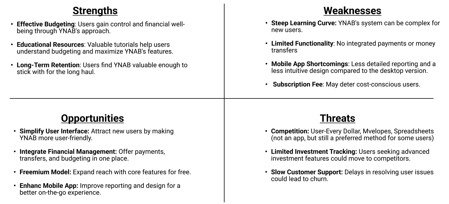
A SWOT analysis was realized with the help of the AI tool, Kraftful. The analysis revealed key strengths and weaknesses, guiding me to identify opportunities for Save & Pay's unique value proposition.
YNAB (You Need a Budget)
Users find the YNAB's budgeting model and educational resources effective, which drive long-term user retention. However, a steep learning curve, lack of integrated payments, and an unintuitive mobile UI hinder the user experience, leaving opportunities for Save & Pay to help users.
.png)
Venmo
Venmo's strengths lie in its user-friendly interface and social features, appealing to Millennials and Gen X. However, it faces challenges in providing comprehensive financial management tools and addressing user concerns about privacy and security.

SWOT Analysis

Research Goals
Understand user budgeting strategies and payment habits
Identify user money management app pain points, desired functionalities, and usability preferences
Learn user money management app usage history and satisfaction
Methodology
Google Forms survey (20 responses received)
3 phone interviews with participants ages 35-44
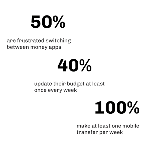
are frustrated switching between money apps
make at least one mobile transfer per week
update their budget at least once every week
Affinity Map
I organized the research insights from the surveys and interviews into categories using affinity mapping, grouping participants' behaviors & attitudes, needs & goals, frustrations, and key quotes.

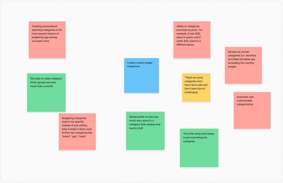
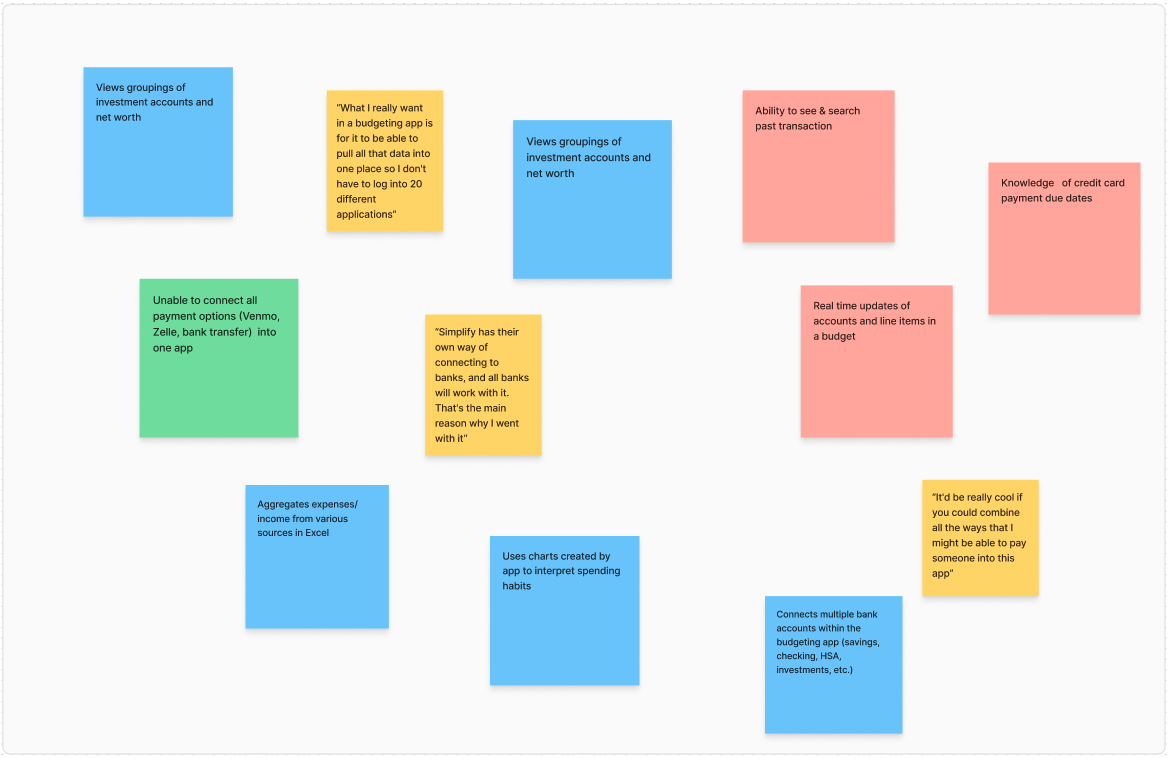
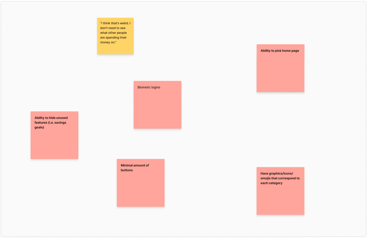
Overall Insights
The following insights highlight users' top needs and desires.
Unified Platform
Integrate budgeting, account aggregation, bill pay,and money transaction functionalities
Flexibility & Customization
Allow extensive personalization of categories, hiding unused features, configuring budget display , and setting custom financial goals
Minimalist Interface
Prioritize a clean design with clear informationhierarchy, intuitive navigation, and minimal distractions
Social Features
Enable secure sharing of budgeting successes or insights within trusted circles
Consolidating Research
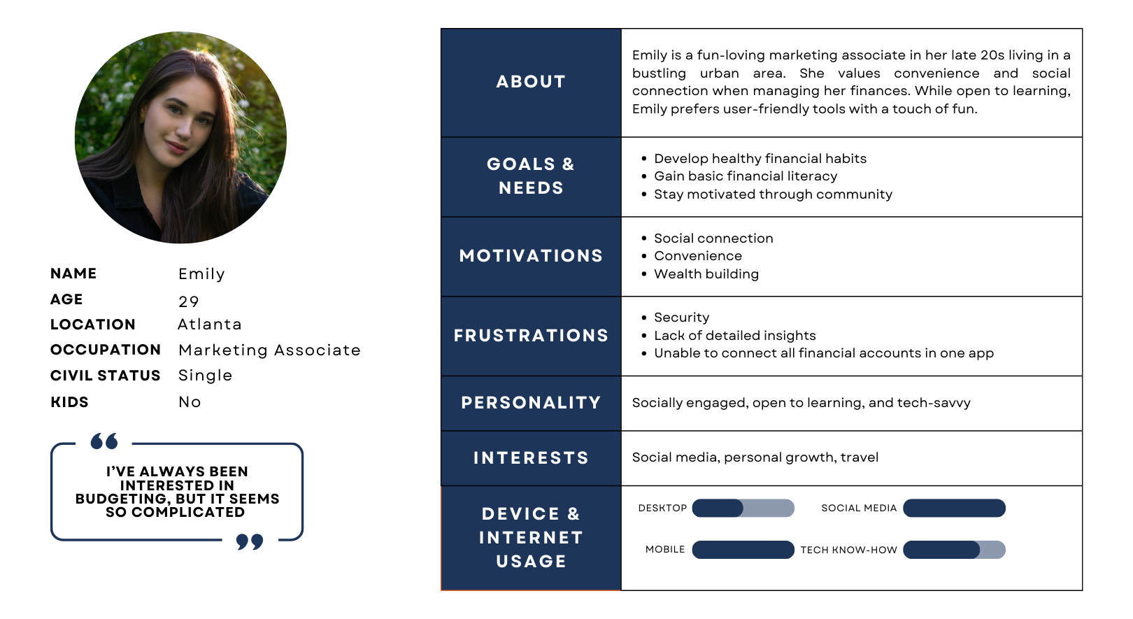
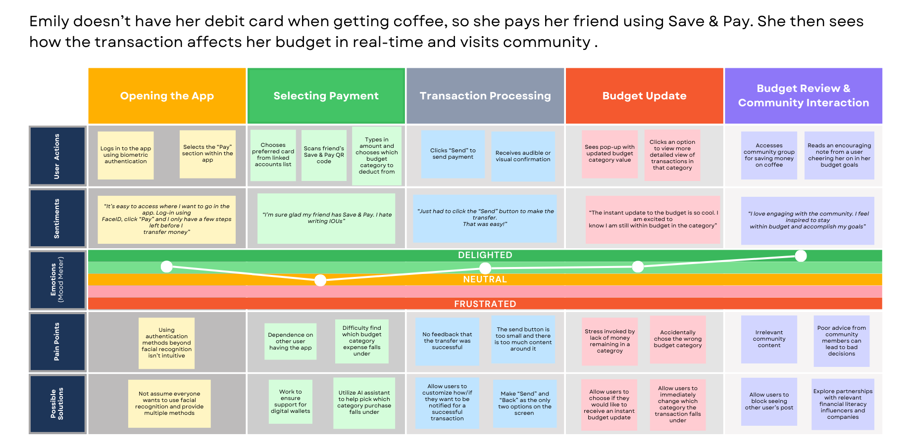
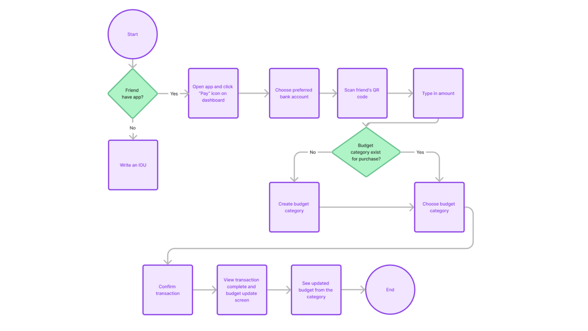
Using the data gathered, I developed our protopersona, Emily & Daniel, along with their journey maps and user flows. These tools grounded my design in real user behavior, ensuring the app addressed their needs at every stage.
.png)
%20(9).png)
%20(6).png)
Crafting the Experience
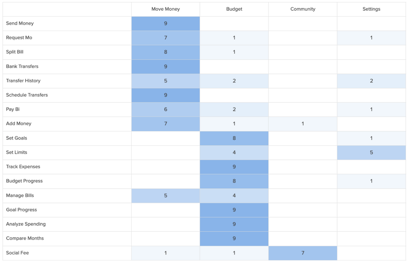
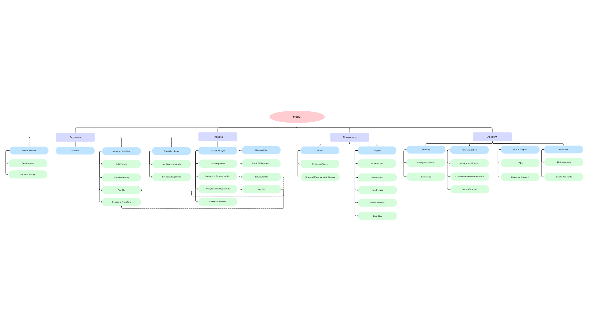
Based on my research, I identified the app’s key features and conducted a closed card sorting study using Optimal Workshop. Participants had The results informed the structure of the sitemap.
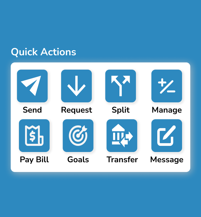
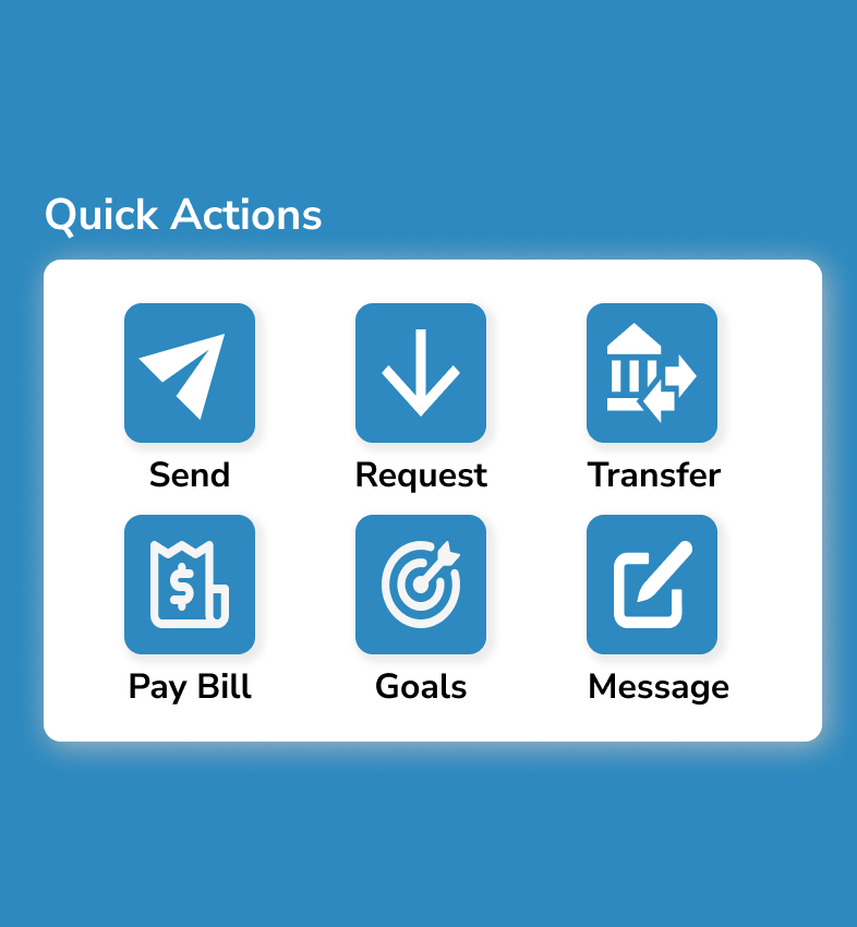
Transactions
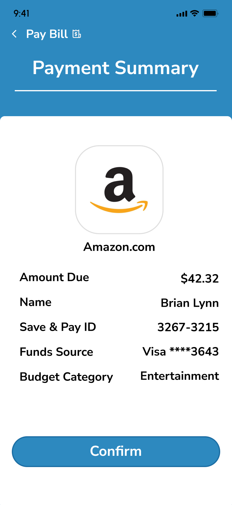
Send, receive, and split payments & pay bills
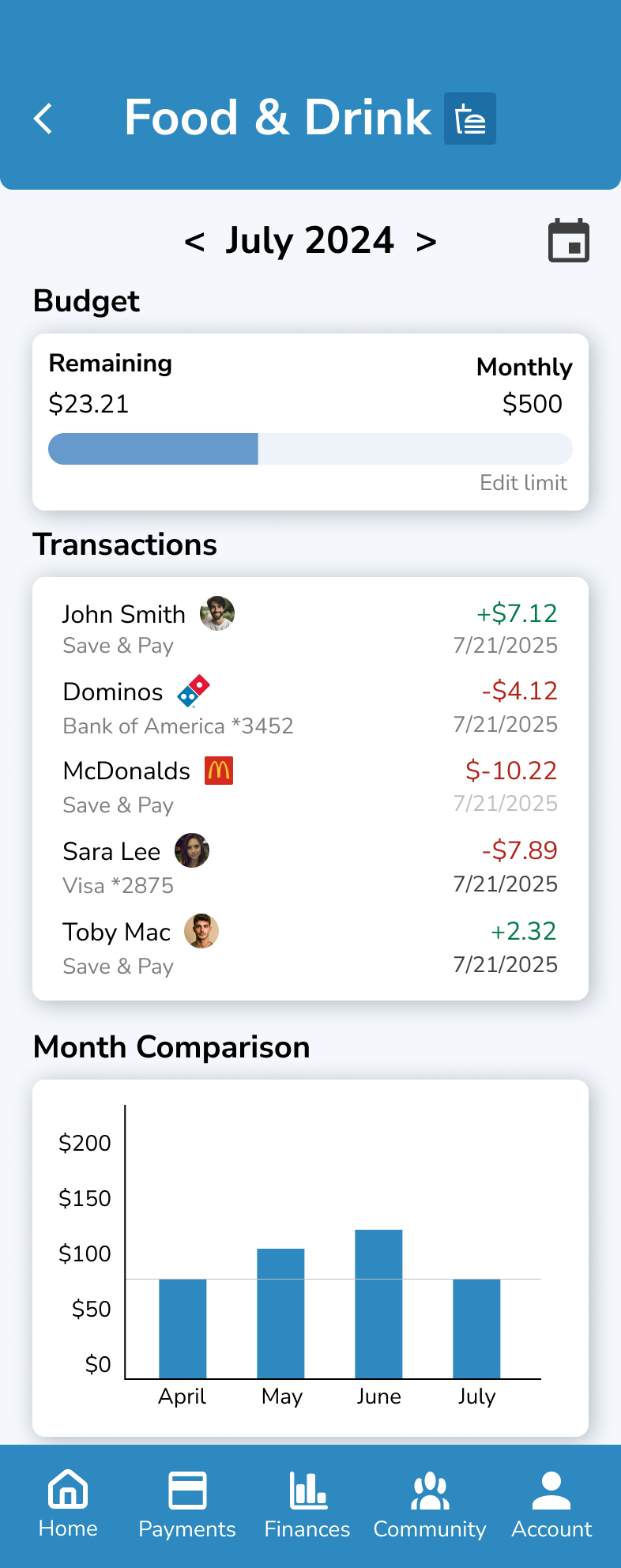
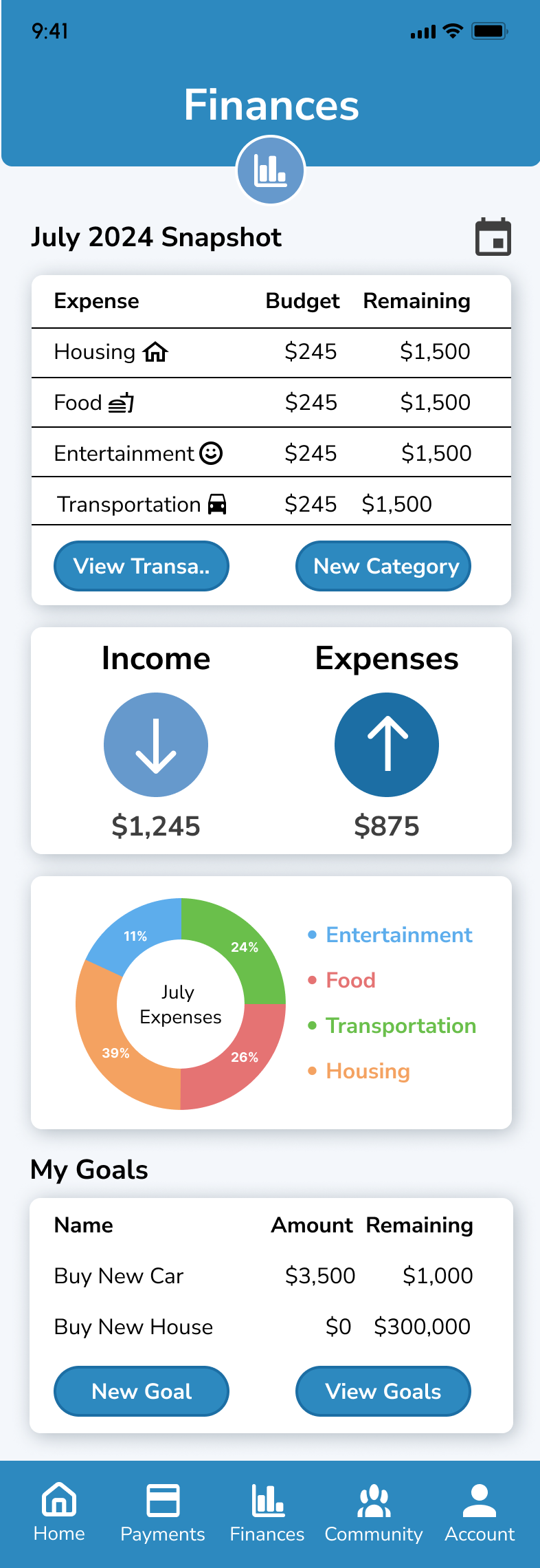
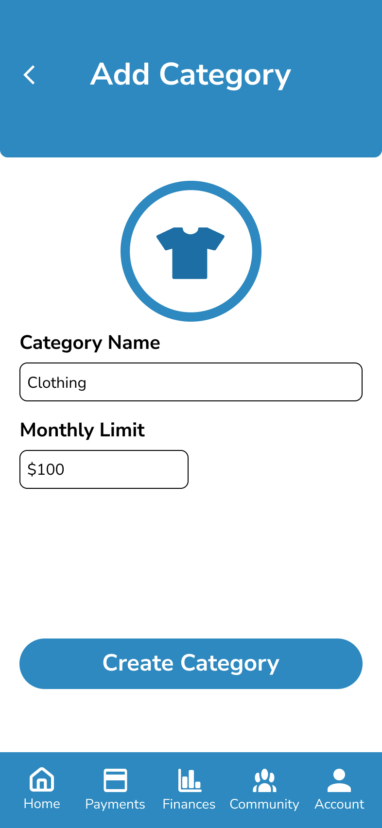
Budgeting
Manage a budget, review transactions, and set goals
Social Media
Join a financial community to ask and answer questions
Card Sorting Results
Sitemap
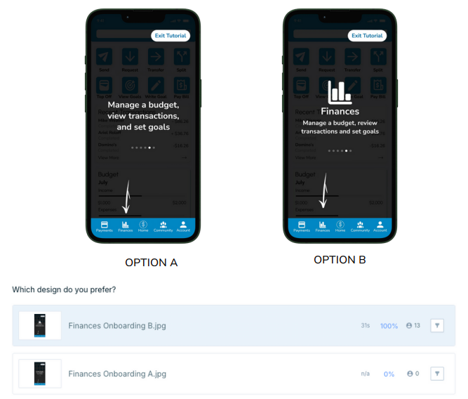
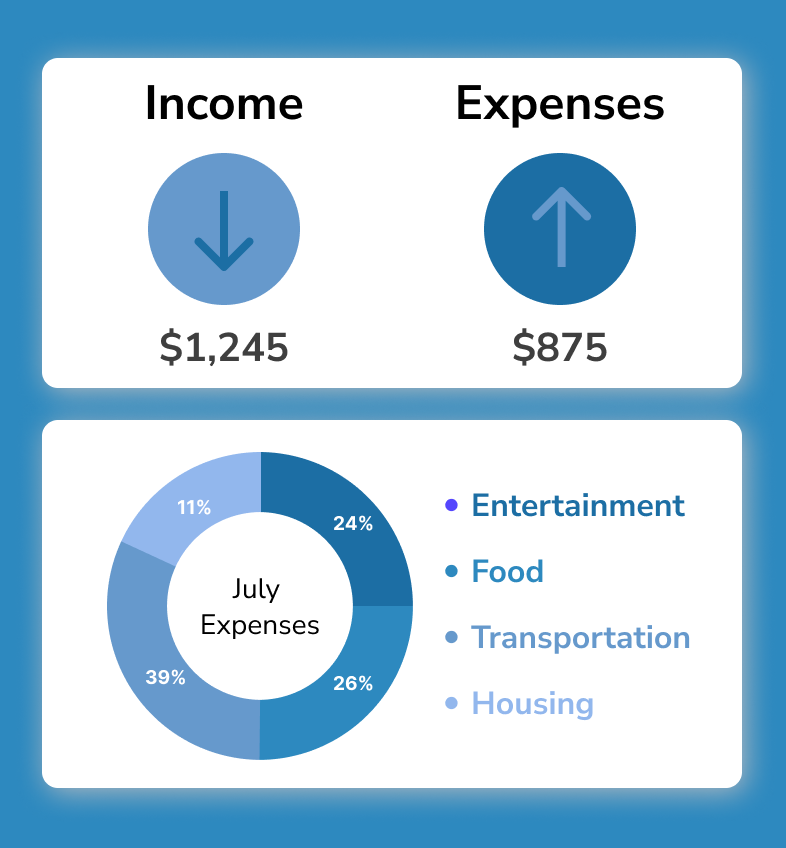
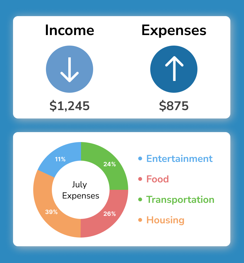
Payments Screen

Finances Screen
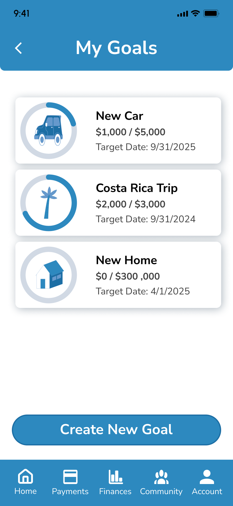
Dashboard
Refining through Feedback
After developing high-fidelity wireframes, I performed usability tests on key tasks, including signing up, paying a friend, and setting a financial goal. I then conducted A/B testing on an onboarding screen using Lysnna.com. The insights from user feedback drove important design iterations, leading to improvements in both functionality and aesthetics.
Usability Tests
Participants
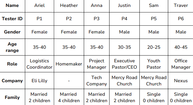
Tasks
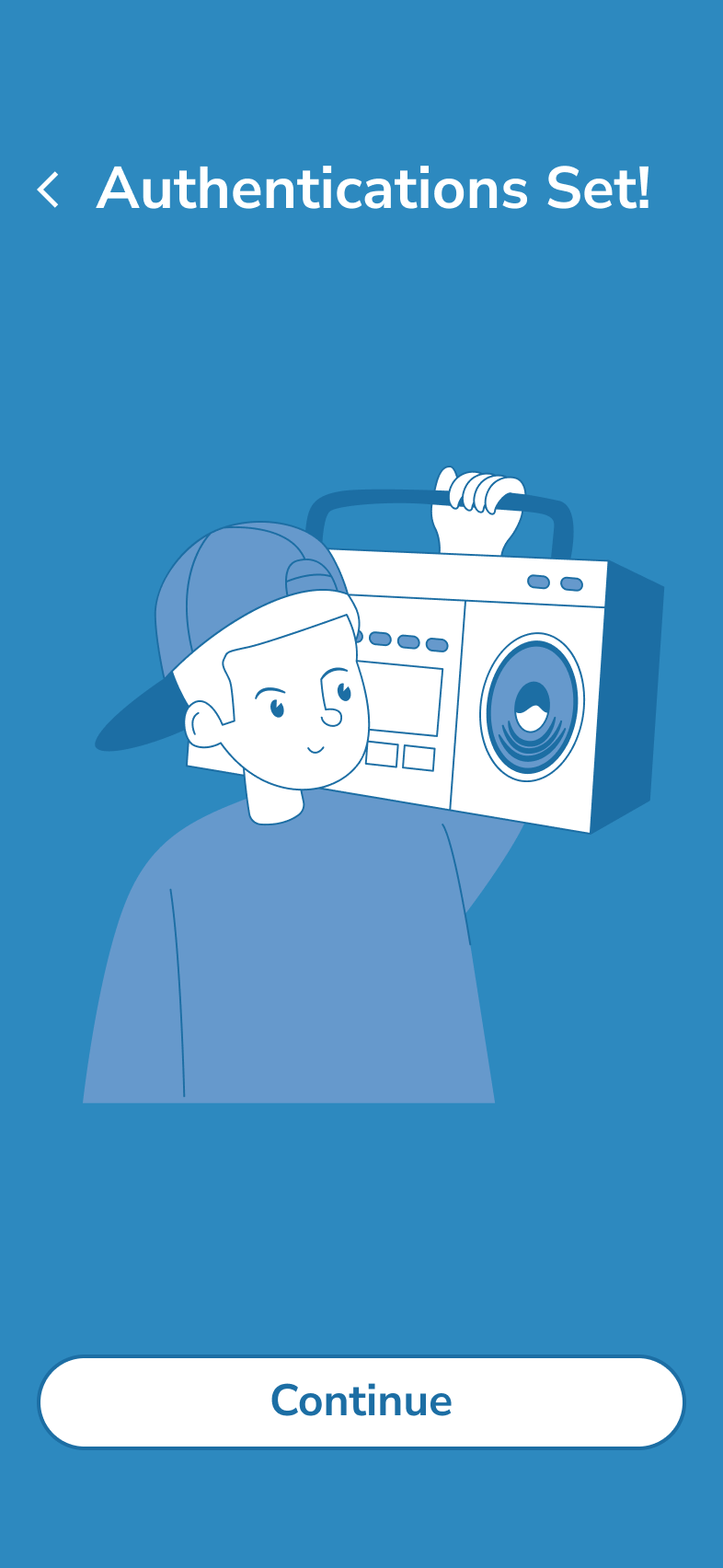
Sign-up & Onboarding: "Register an account and complete the onboarding"
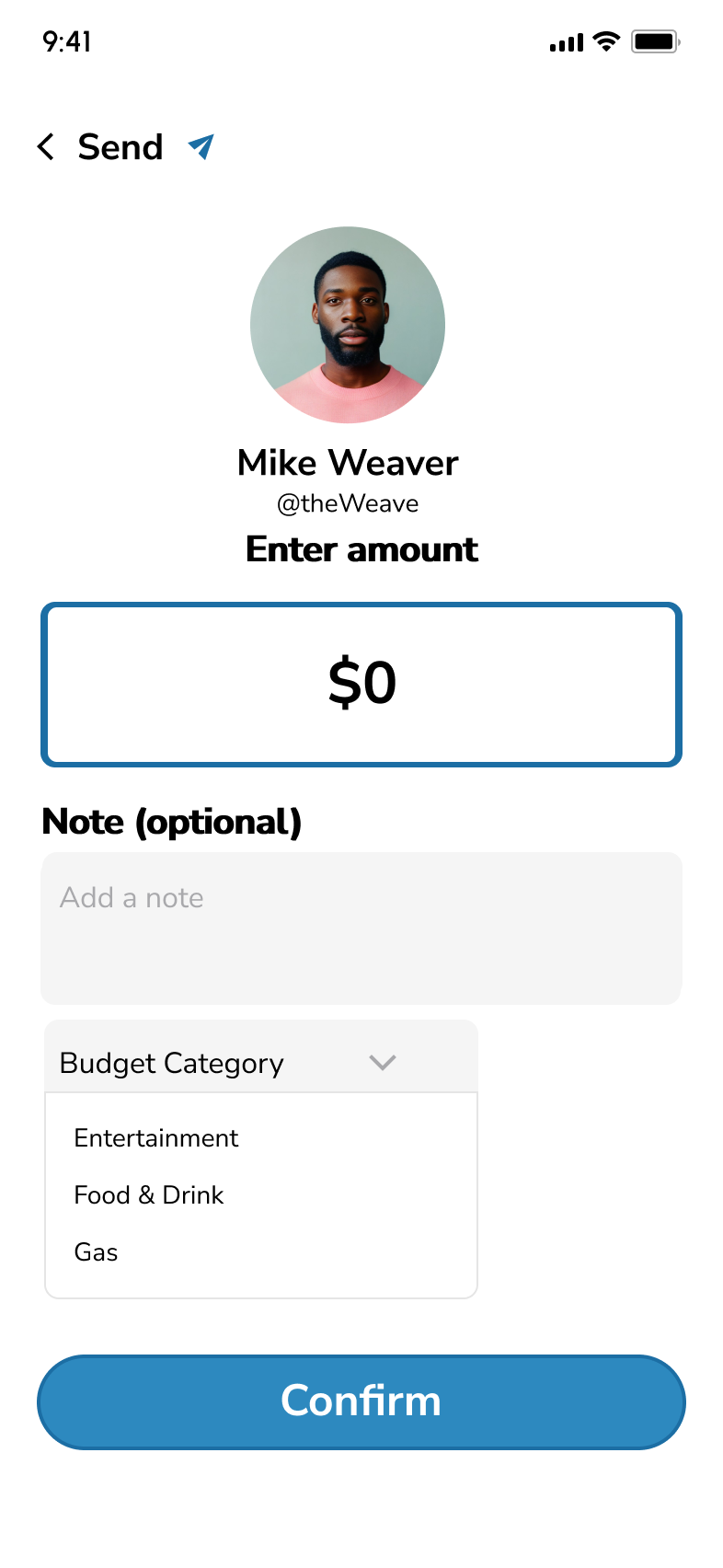
Sending money: "Pay your friend Mike for coffee using the app”
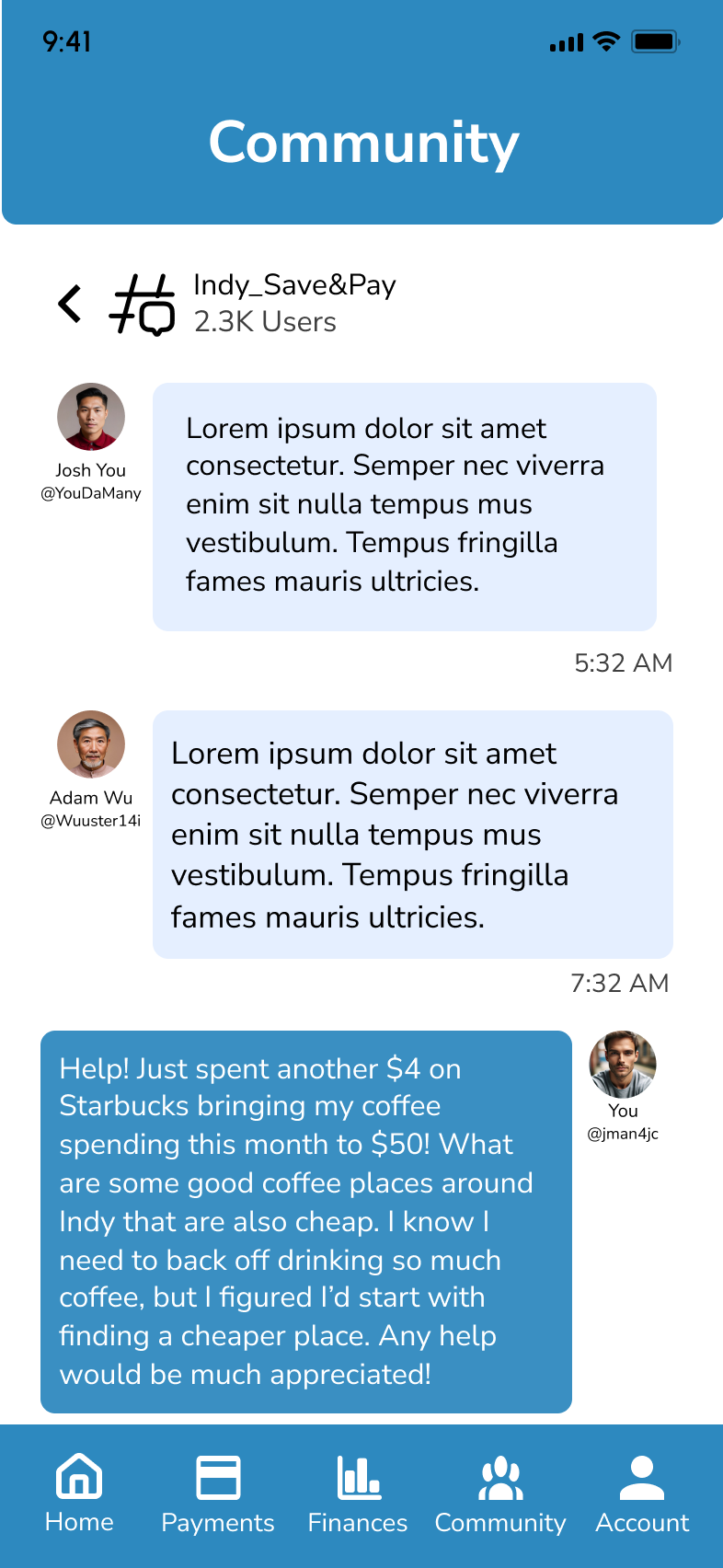
Posting to the Community: “Visit the community and ask the Indy_Save&Pay Group if they have recommendations for cheap coffee"
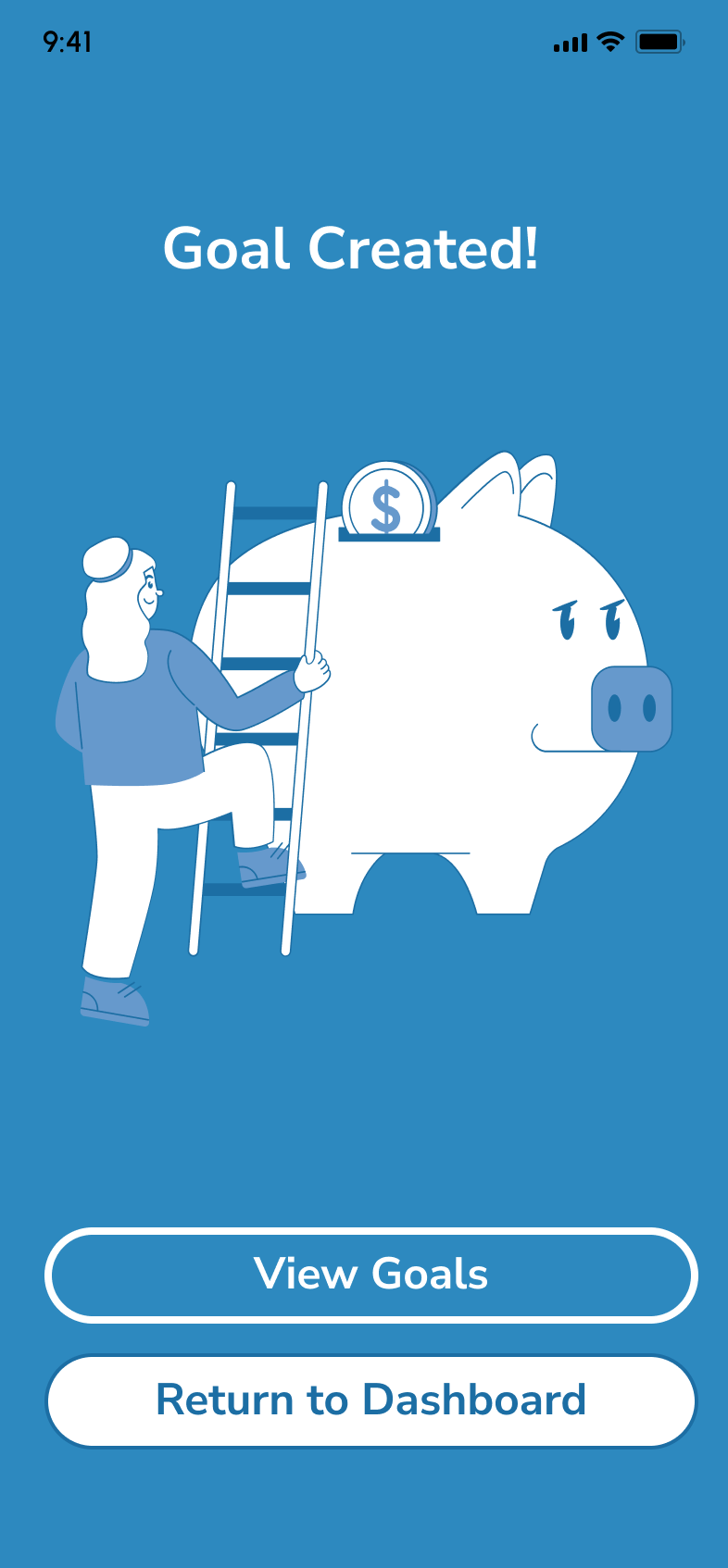
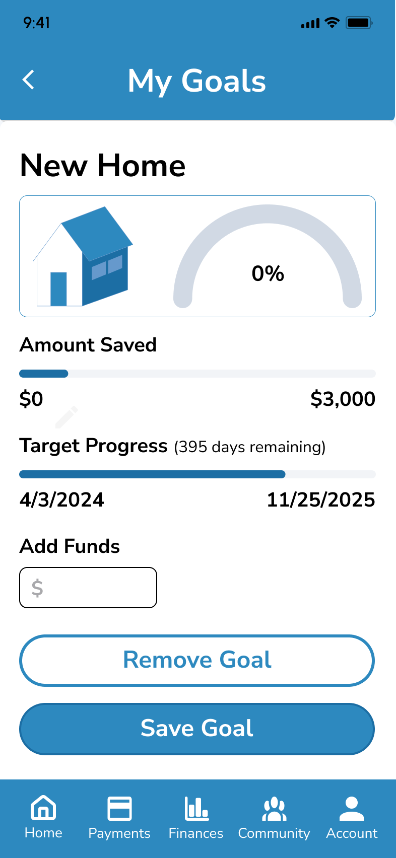
Creating a Goal: “Create a new goal named 'New Home.'"
Results
During testing, I carefully recorded observations of both what users said and how they interacted with the app. Key metrics such as task completion time, Nielsen's error severity rating, and the SEQ (Single Ease Question) were tracked. I then organized all the notes on post-its before categorizing them in a Rainbow Spreadsheet for deeper analysis. Finally, iterations were made on the design based on feedback.
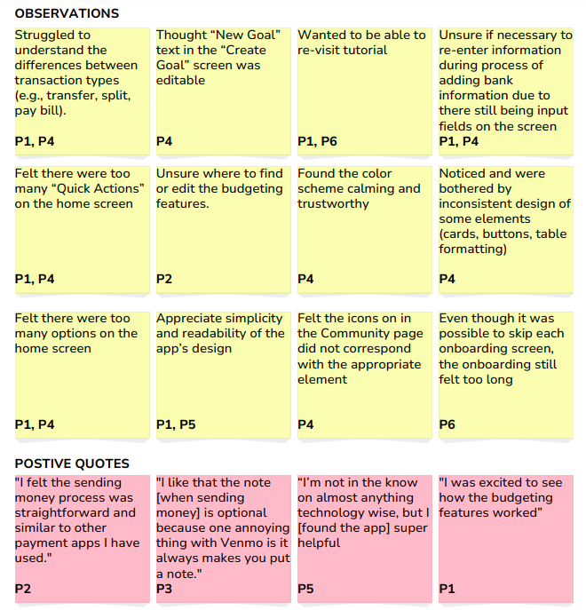
Rainbow Spreadsheet

Metrics

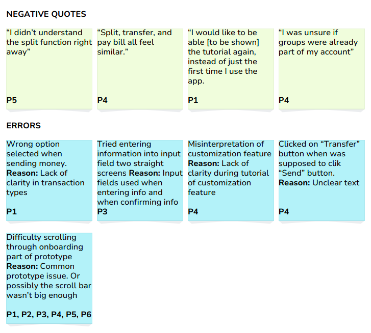
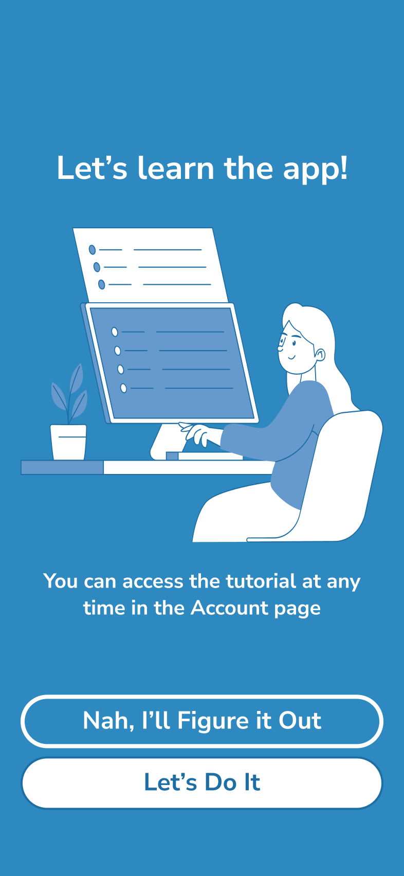
A/B Testing
A/B testing was conducted thru Lyssna.com to determine which onboarding screen users preferred. The results were clear: users overwhelmingly favored the screen with the icon, with 100% of users choosing this screen. Based on the feedback, the icon was incorporated in the final design.
Iterations
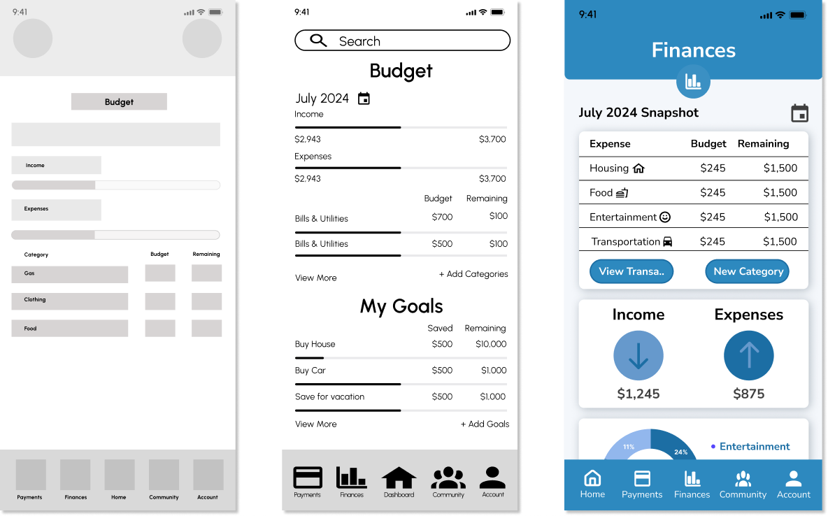
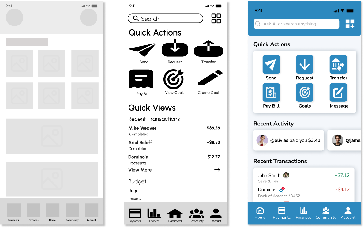
Iterations were made based on issues users had with the design. While changes were made on several other wireframes, the following section highlights key issues and includes before and after high-fidelity wireframes.

Prototype
Conclusion
In conclusion, Save & Pay effectively addresses user needs by providing a seamless, all-in-one financial management platform that balances usability, functionality, and engaging emotional design.
Usability testing revealed a user-friendly experience, evidenced by the average SEQ score of 6.5/7. This testing, along with A/B tests, also helped me consider improvements to both the functionality and aesthetics of the app.
Iterations such as enhancing contrast for better accessibility and simplifying the dashboard layout, further improved the design. Future iterations could focus on enhancing the community features, such as offering financial management classes, to further strengthen the app’s unique value proposition and increase user engagement.


The All-In-One Money Management App
I designed a unified financial platform that combines payment and budgeting functionalities to address user frustration with juggling multiple apps. Through competitive analysis, user research, and usability testing, I identified key user needs and created a solution that achieved an impressive 6.5/7 SEQ score. The final design features a unified platform with customizable features, a minimalist interface, and social components to create a comprehensive financial management experience. This case study includes several research artifacts—click any image to enlarge and explore more.
Bridging the Gap Between Payment and Budgeting Apps
Users are frustrated with switching between separate payment and budgeting apps. I hypothesized that a unified solution would better serve their financial management needs. Research confirmed this pain point, with 50% of survey respondents expressing frustration with using multiple money apps.
Understanding User Needs Through Multiple Methods
I conducted a comprehensive research phase including a SWOT analysis of competitors (YNAB, Venmo), surveys (20 respondents), and interviews (3 participants aged 35-44). Key findings: 100% make mobile transfers weekly, 40% update budgets weekly, and users desire unified financial management.
Consolidating Research into Actionable Design Direction
Research insights revealed four key user needs: a unified platform, flexibility & customization, minimalist interface, and secure social features. These findings guided the development of personas, journey maps, and user flows that grounded the design in real user behavior.
Organizing Features Based on User Mental Models
Using card sorting with Optimal Workshop, I determined the optimal information architecture for the app's key features: transactions, budgeting, and social components. This research directly informed the sitemap creation, ensuring the app structure aligned with user expectations.
Crafting a User-Centered Experience
I created wireframes that evolved into high-fidelity mockups, focused on implementing a unified financial platform with customizable features and a minimalist interface. The design process was iterative, with improvements based on ongoing user feedback.
Refining Through Data-Driven Feedback
I conducted usability tests on key tasks, measured with completion time, error ratings, and SEQ scores (averaging 6.5/7). A/B testing on onboarding screens showed 100% preference for the icon-based design. Iterations addressed contrast issues, simplified dashboard, and enhanced emotional design elements.